We are a full-service publishing design agency specializing in book layout, cover design, and editorial graphics. From print-ready files to digital publishing, we help authors and companies create professional, eye-catching publications. Whether it’s magazines, e-books, catalogs, or reports, we bring your content to life with stunning design.
Jasper Cole – Book Author
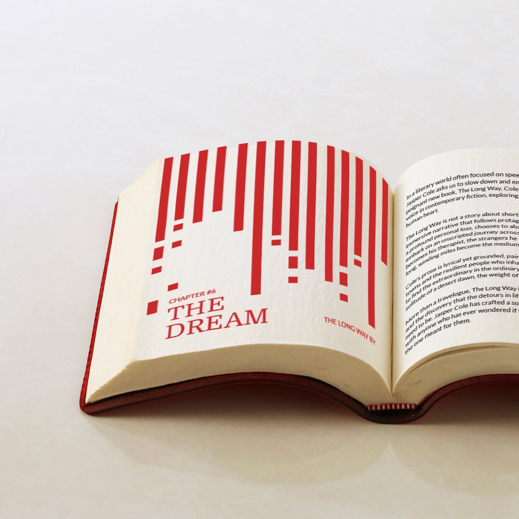
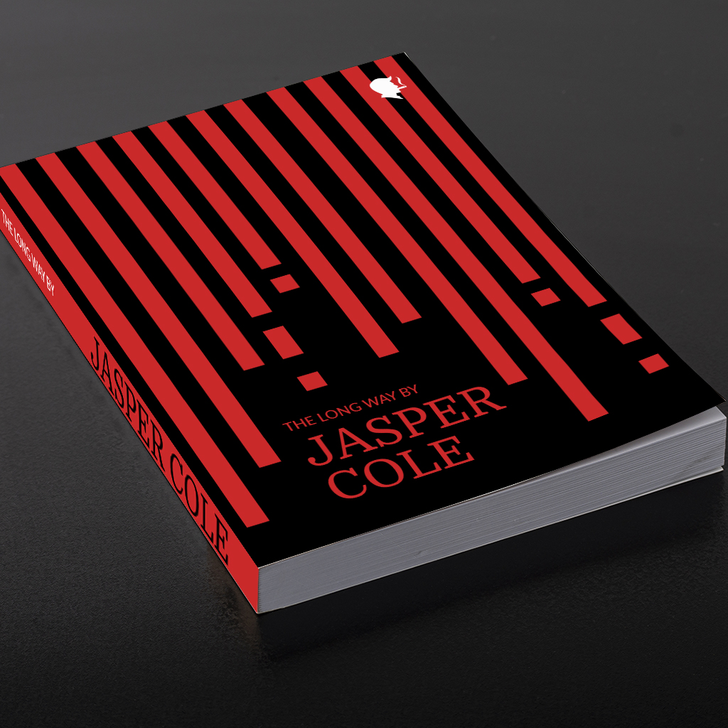
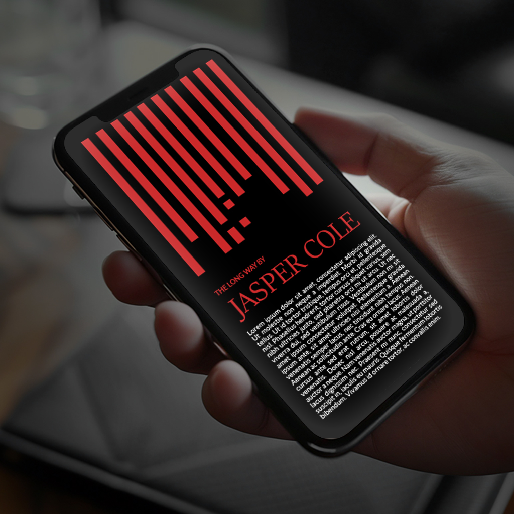
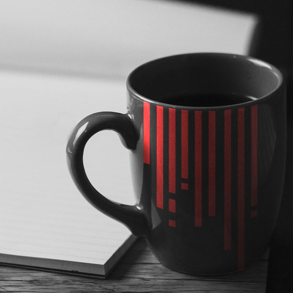
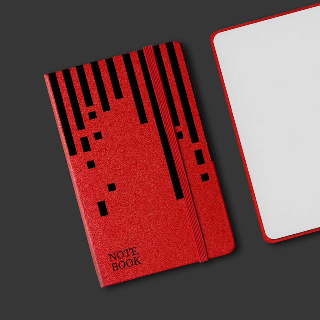
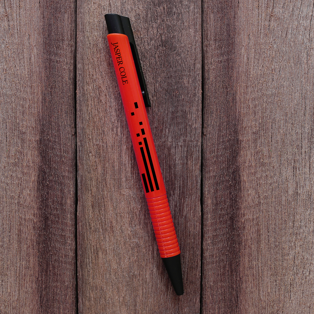
Jasper Cole is an author who crafts stories where raw human emotion meets the unforgiving truth of the open road. His book, “The Long Way,” is a narrative journey dedicated to exploring lives at their most vulnerable and their most resilient, mile after mile. By blending literary depth with a genuine respect for the struggles that shape us, Cole provides readers with an experience that feels both profoundly personal and universally understood. His work represents more than just words on a page—it offers readers the confidence of finding meaning in the journey, delivered through a lens of unflinching honesty and narrative dedication.
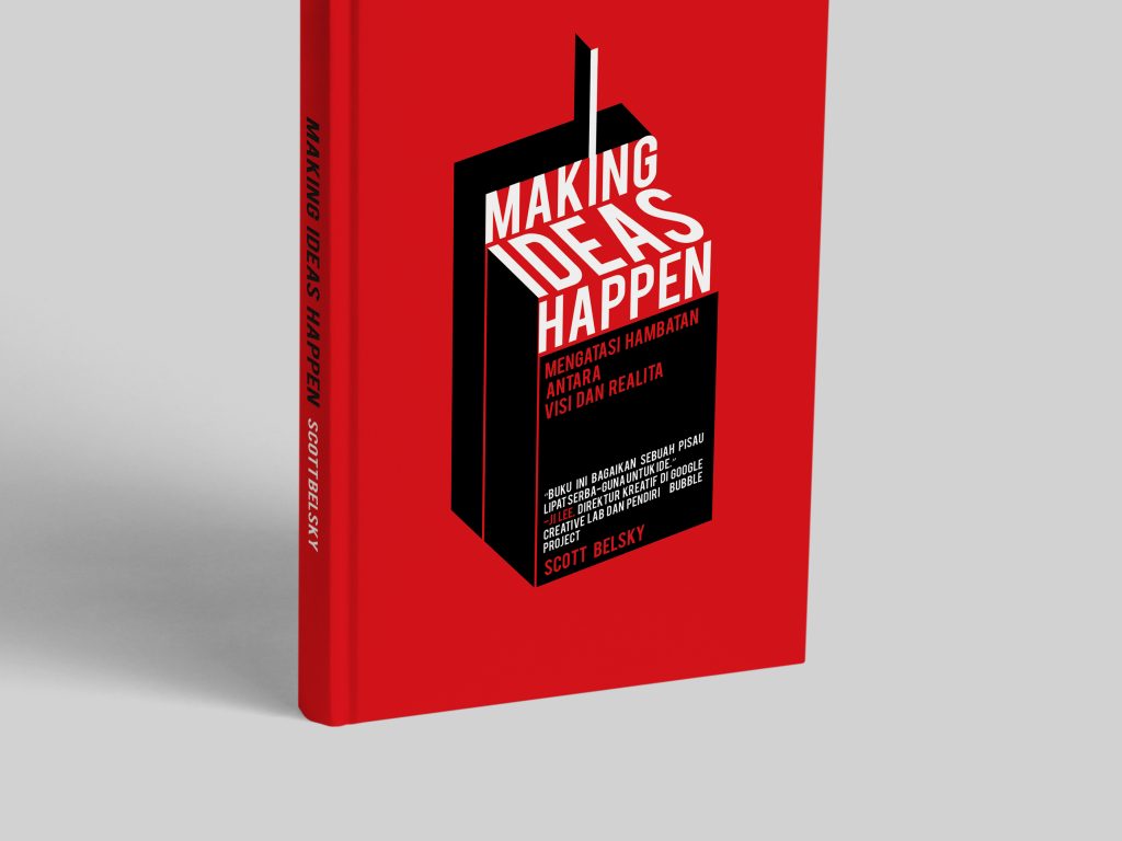
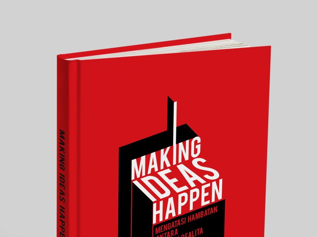
Making Ideas Hapen – Scott Belsky
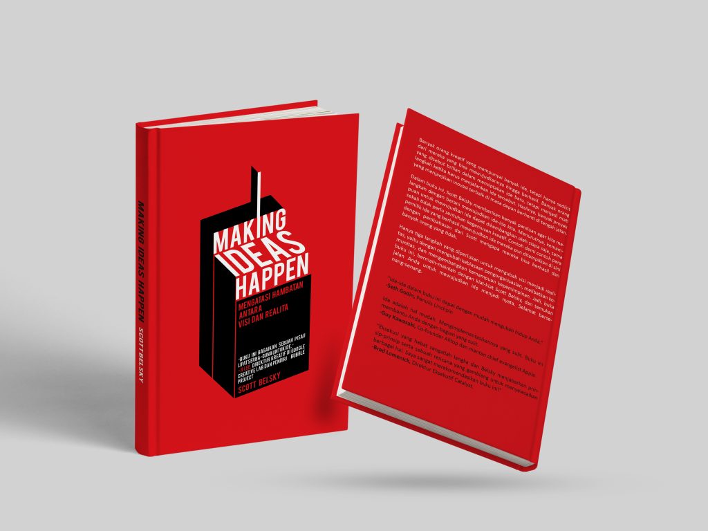
This project showcases a bold and modern book cover design tailored for a business and productivity audience. The design features a striking corporate minimalist aesthetic, utilizing a solid, high-energy red background that instantly commands attention and evokes a sense of urgency and action. At the center of the visual hierarchy is a strong, custom graphic of a black box paired with clean, architectural sans-serif typography that contrasts sharply with the background to maximize legibility. The layout is systematically applied across the entire publishing anatomy, showing seamless continuity from the front cover to the spine and the back cover layout, ensuring a cohesive and premium look for both retail display and digital platforms.
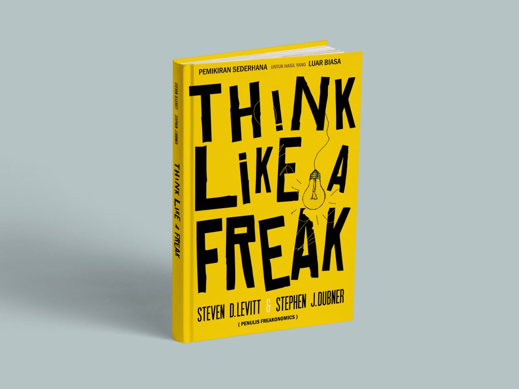
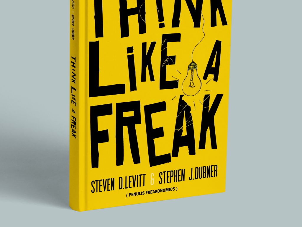
Think Like a Freak – Steven D Levitt & Stephen J Dubner
This design embraces an energetic, conceptual approach tailored for contemporary non-fiction. The layout relies on a vibrant yellow color palette paired with an expressive, distressed, and hand-rendered sans-serif typeface that reflects the unconventional and analytical nature of the book’s content. The visual hierarchy is heavily driven by typography, with the title taking up the upper two-thirds of the grid to create a massive visual impact. The 3D book mockup presentation demonstrates how the typography wraps seamlessly around the spine, maintaining a balanced distribution of white space and technical details like author names and publisher credits.
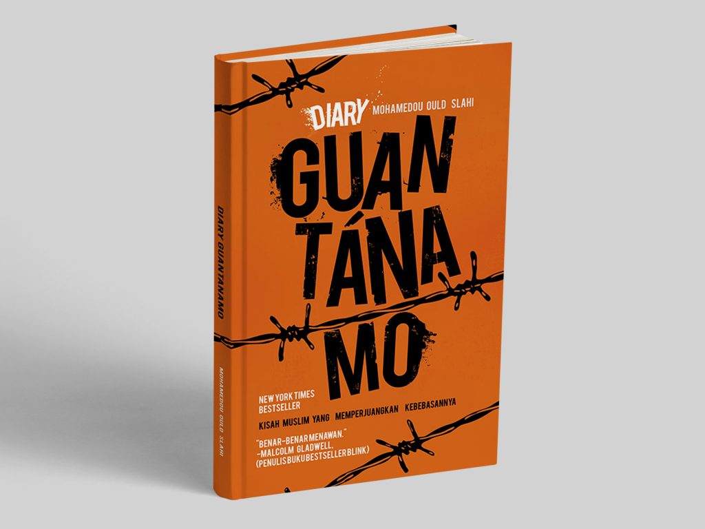
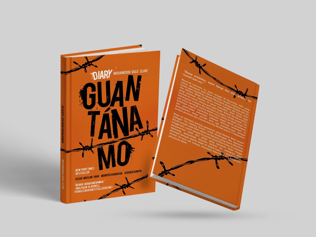
Guantanamo – Mohamedou Ould Slahi
Focusing on historical and political subject matter, this editorial layout project utilizes a deeply symbolic and textured design language. The cover is anchored by a stark orange background—a direct cultural and visual reference to the subject—overlaid with raw, rugged typography integrated with a barbed wire graphic. The text layout is meticulously structured to ensure that the heavy, thematic design elements do not compromise readability. The multi-angle presentation illustrates both the front and back layout structures, highlighting how the thematic elements, sub-headers, and promotional text maintain grid alignment across the physical wrap of the volume.
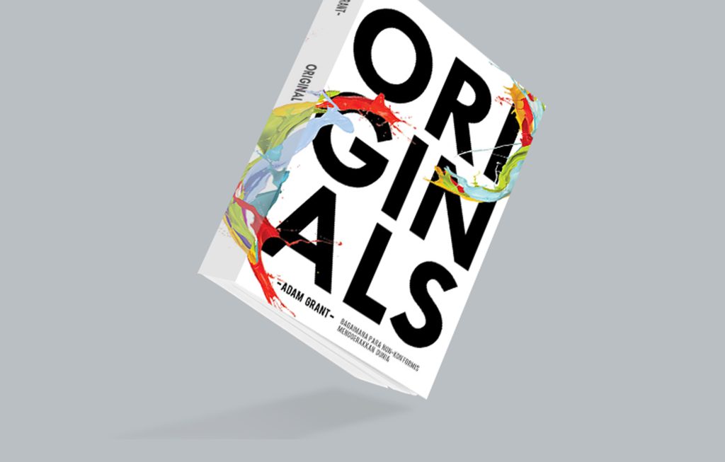
Originals – Adam Grant
This project explores dynamic composition and fluid visuals within publishing design. Breaking away from rigid horizontal grids, the layout features a striking diagonal typographical alignment where the text is intertwined with organic, colorful abstract graphics that burst through the lettering. Set against a clean, premium white background, this interaction between structured typography and fluid color symbolizes creativity, non-conformity, and innovative thinking. The layout design is optimized for high visual impact, ensuring that the cover remains distinctly legible and visually captivating even when viewed as a small e-book thumbnail online.

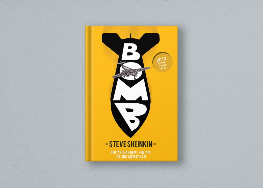
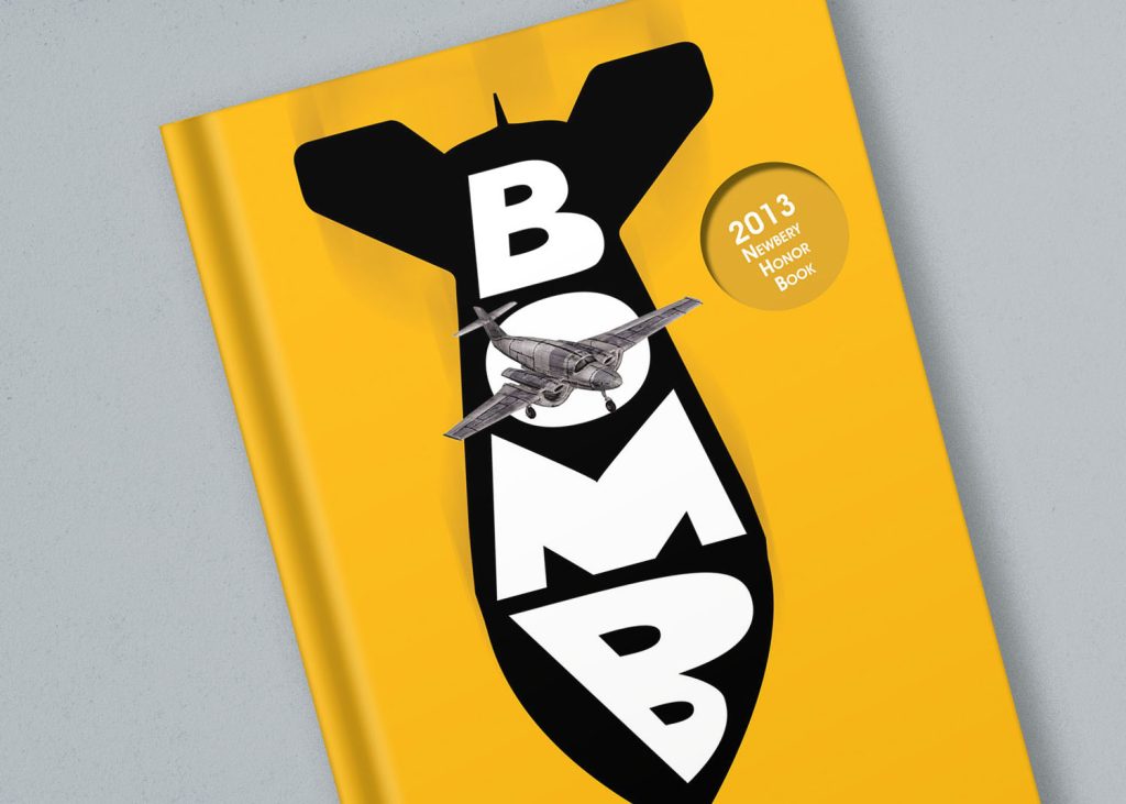
Bomb – Stevesheinken
This editorial design focuses on strong illustrative integration and high-contrast vector graphics. The cover utilizes a minimalist yet highly impactful layout, positioning a large, iconic black silhouette of a bomb against a solid yellow backdrop to create a focal point that cannot be missed. Customized typography is cleverly embedded within the silhouette, demonstrating advanced spatial planning and typographic integration. The presentation highlights a close-up crop of the layout, showcasing the precise execution of alignment, text tracking, and texture that gives the final printed product a premium, graphic-novel-inspired feel.
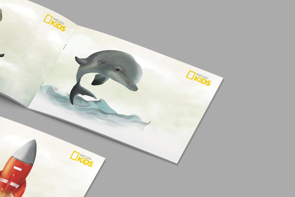
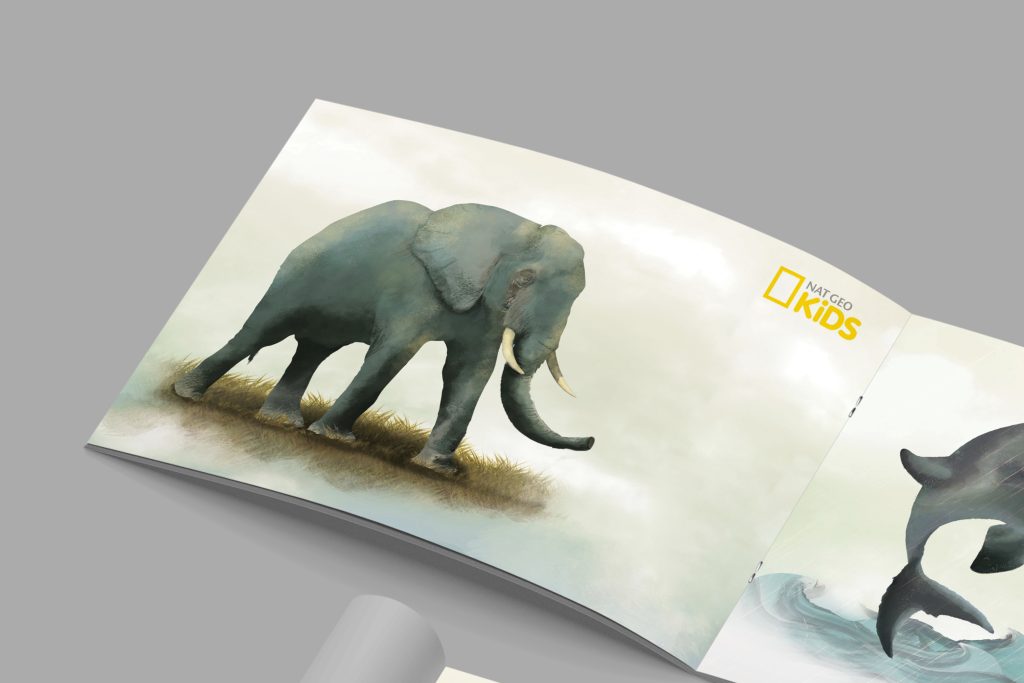
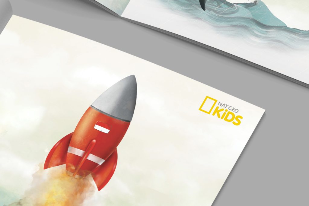
Kids Illustration – Nat Geo Kids
his project shifts toward storytelling and watercolor illustration layouts designed specifically for children’s publishing or educational media. The layout focuses on a harmonious balance between expansive, soft-toned illustrations and negative space, allowing images of wildlife and imaginative elements like rockets to guide the young reader’s eye naturally across the spread. The technical execution involves seamless double-page spreads, precise color grading for print, and a clean, spacious layout grid that accommodates text overlays without cluttering the playful and engaging visual narratives.